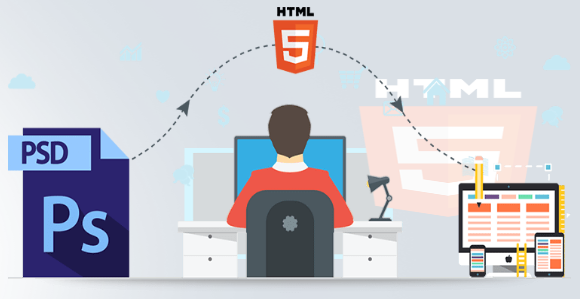
The Ultimate Developerʹs Guide to Converting PSD to HTML
Our team at Mayven Studios has worked on web projects for a long time, over 15+ years now. Wow we are old. We started way back when slicing images from a PSD for backgrounds was still a thing and now do everything from branding design to full stack applications.
Front end development is exponentially more difficult than it was even five years ago, with new code requirements, design standards, and the introduction of mobile and responsive web. We’ve coded thousands of pages in the last year alone, and we’d like to share some of the tips we’ve established from our own experience designing and coding front end development for our customers around the world.
This complete guide to converting PSD to HTML is completely free to share with friends and colleagues.
Tip: For any front end project, it’s not required at all to have a Photoshop file or any design file for that matter. What’s most important is that you have some rough wireframe or idea of what the content and layout will be on each page you are building. We will help you take it from there.
For the sake of this tutorial, we will be working off this Figma file: <link>
Should You Use a PSD to HTML Software Converter?
You could be tempted to use software that promises to automate the process. There are several sites online that offer to convert PSD to HTML through automation apps. The problem with these tools is that you can’t provide a truly custom HTML/CSS code using software automation, and these tools don’t always provide the pixel-perfect conversion that can be done through hand-coded interaction with the PSD file and the converted file. Unless you’re good with fixing bugs and know how to write front-end code, conversion software could be more hassle than it’s worth.
That isn’t to say that automated conversions don’t have a place in the front end development world. Some site owners benefit from these tools. For some examples, you can use automation software for:
- A simple Shopify ecommerce store
- A small business site on Squarespace or Basekit
- Cratejoy for a subscription box business
In other words, if the goal of the site is to sit on a hosted, template site, then using conversion software could be beneficial. For any other site, the design needs its own personal touch from a designer.
Software You Need to Convert PSD to HTML for Front-End Development
Just like any other job, you need the right tools to get started. You can search the Internet and find numerous utilities, tools, and automation software. Luckily, we’ve tried quite a few of them over the years, so we can narrow it down for you. Nothing is worse than building a site with cumbersome, clunky tools that don’t really do what you need them to do.
Here are the tools we suggest you download and purchase before you get started on a PSD to HTML conversion.
- Sublime Text: This tool is a step up from the popular Notepad++ (which is an alternative if you don’t like Sublime). This tool color codes your text depending on the language you use, and it converts between Apple and Windows more easily than other text editors.
- Adobe Photoshop: Photoshop is the originator of PSD files. Adobe Photoshop is a part of their Creative Cloud Suite. You can get this software at a flat-rate cost or you can pay as low as $19/month to have this software. This is much more affordable than what front end designers had to spend years ago.
- Figma
- Sketch
- CSS Hat (Photoshop Add-on): Save yourself some time and get this Photoshop add-on. This tool will turn a Photoshop layer to CSS instantly.
- Avocode: In most front end development assignments, you’ll be working in a team even if your team is you and a developer. Avocode lets you export assets and collaborate with other developers and designers.
- PNG Hat: If you’re a gaming designer, this tool helps you slice assets for gaming designs. It also compresses images during export for faster load times without causing the image to suffer from poor quality.
- CSS3ps: Similar to CSS Hat, but this is a cloud-based tool that converts your Adobe Photoshop layers to CSS3.
Choose a Framework (or Don’t)
Front-end development frameworks are so hot right now. These frameworks can make front end development must easier without starting from scratch. That doesn’t mean you need to tie yourself to a specific framework for every project. Choosing no framework is just as acceptable as long as you know how to work without one.
You have hundreds of frameworks on the market. Software frameworks started out and are most common in back end coding, like Laravel (PHP), Ruby on Rails (Ruby), but front-end frameworks have crept into the front end design industry. Front end frameworks focus on the three main areas of design: HTML, CSS and JavaScript frameworks.
The question you should ask yourself is if you want to use a framework. If you’re not used to the one you choose, then you need to learn how to work with it as you code, which increases the time frame for the project. Most frameworks reduce the amount of code for a page, but they can add some complexity to your project if you aren’t familiar with their syntax and the framework’s “way” of doing things.
- Pros: Frameworks reduce the amount of code used on the site, and they can even reduce coding time if you know how to use them. If used properly, frameworks can increase efficiency and improve the design.
- Cons: With hundreds of frameworks on the market, you might be forced to learn while you’re designing, which doesn’t usually produce the best code. The framework must have good community support, or you could be stuck indefinitely with a framework that doesn’t have any upgrades or support.
If you decide to tie yourself to a framework, you might as well go for the best. We’ve worked with a few frameworks, but we find the following two to be the better choices.
Twitter Bootstrap (or just Bootstrap): Bootstrap makes front end development exponentially easier. Plug in the CSS and JS files and get started. It’s even great for back end coders who aren’t very good with front end development. Bootstrap is fully responsive too, so you can inject responsive design easily into your projects.
Foundation: Foundation does basically the same as Bootstrap, but it’s more customizable and offers more components. For instance, Foundation has form validation.
Whether you choose Bootstrap or Foundation, you can’t really go wrong either way. Both of them will give you the responsive design and grid system you need for development.
Design the Layout Type for the Project
Before you even perform the conversion, you need to determine the layout. You have four main layouts to choose from.
- Responsive: You can’t get away from the term “responsive” in the design industry. Responsive designs basically shift the layout of a page to fit the screen. This layout is the foundation for most web apps that cater to mobile devices.
- Mobile Only: Some apps aren’t meant to work on desktops. These mobile apps only need a design that fits on a tablet or a smartphone.
- Fixed: Fixed layouts are useful for desktop-only designs. Fixed designs have a static width and height, and the elements contained within the layout don’t shift for screen size or when the user minimizes the window.
- Fluid: Fluid designs are beneficial for mobile and desktops. The elements within their containers shift as the user minimizes the browser or uses a smaller screen.
You might notice that Fluid and Responsive web design sounds similar. They are alike, but Responsive is much more useful for targeting mobile devices. Fluid is used more for different browser sizes in desktop apps. Responsive design uses CSS media queries to change the size and location of elements when the screen size changes. Fluid design moves elements around when the screen size changes, but the elements still take the same width and height percentages regardless of the screen size. The result is that Fluid designs don’t always shift elements in a user friendly way on the screen, so it’s better to stick with responsive for mobile designs.
Fixed is a much easier layout to use, but as we mentioned the layout does not shift depending on the screen size. These layouts force users to scroll if the screen is too small and large screens show a lot of white space when the layout is too small.
Start by Exporting Images from Your PSD File
In any PSD file, you have images that you need, like background images for the header, or other things that can’t be replicated with CSS. This is the starting point for your conversion. Take your PSD file and cut out the images that can’t be re-created using standard CSS exporting tools. Export these assets to PNG or whatever file format you feel is necessary.
It used to be that you needed to cut out shadows and carefully place them next to your images, but remember that CSS3 has shadow effects. You just need the images, and CSS3 can do the rest of the shadowing.
Write the HTML for Each Section
A good designer knows that one page can be divided up into multiple sections. To keep your designs uniform and easily laid out in terms of HTML code, you should write the HTML sections from top to bottom. HTML5 has made sectioning your code much more efficient.
Header: The very top part of the page is the header. It usually contains the logo and any main menu items that lay horizontally at the top of the page. It also contains a separation line between the header and the main content.
Hero: Not every page has a hero section. This section is a large area at the top that makes a particular image or offer stand out from the rest of the page. It’s located just underneath the header section.
Slideshow: Some site owners prefer a slideshow at the top of the page. You code this section next since it also includes a list of images that slide across the page.
Content: This section is the main text area that contains all of the content including text, images, buttons, and basically any components that make up the dynamic meat of the site.
Footer: The footer section is at the bottom of the page. It usually contains contact information, some links to content such as a blog or about page, and any social media links for the business when you are building marketing pages.
Once you create your HTML sections, you must review it for syntax accuracy. Nothing is worse than building out a site only to find the main HTML is missing a closing tag. It can take hours to troubleshoot a minor syntax error in HTML, but it can cause major usability issues for your users. Take the time now to review the code for any errors.
To help speed up code review, use an HTML validator.
If you’re not an expert in HTML coding, you can read some in-depth tutorials. Here are two links that can get you started.
Next, Add Your Styling with CSS
Now that you have your HTML shell, it’s time to add some styling with CSS. If you’re using a framework such as Bootstrap, you might already have a bit of styling set up, but it’s time to add your own designer personal touches to the code.
A CSS tutorial is a guide in itself, so we’ll link you to a few places where you can learn CSS.
Smashing Magazine: The online magazine for designers and coders.
Mozilla’s CSS Guide: Learn CSS styling from the browser experts themselves.
CodeCademy: Code and practice while you learn CSS.
You might even go with a CSS compiler, also called preprocessors. Just like front end frameworks, you have numerous options as well. However, the three main preprocessors are SASS, LESS, and Stylus.
Preprocessors in CSS are similar as those used in interpreted languages such as PHP and the older Classic ASP language. Preprocessors have several benefits, but one of the most notable is that you can use variables. Traditionally, CSS didn’t allow you to use variables.
The one limitation to using a preprocessor is that your project is then tied directly to that preprocessor without an option. Your whole team must use it, which means if no one knows how to use it, everyone needs to learn.
Personally, we prefer SCSS and Bootstrap. SCSS is a preprocessor created in Ruby that generates CSS. We covered Bootstrap. It lets you quickly set up a layout template that’s fully responsive without any effort on your part.
Add Interaction with JavaScript
With the HTML and CSS shell created, it’s time to get started on the JavaScript portion of the site. If you don’t know jQuery, it’s time to stop now and read up on how it works. jQuery makes dynamic front end code much easier to work with than raw JavaScript. It’s a library that organizes the DOM and adds some extra functionality for more easily creating dynamic layouts.
Even if you know jQuery well, there is nothing stopping you from getting a little help from some frameworks. The two most popular are vue.js and react.js. These two frameworks make it easier to hook HTML elements with JavaScript data and functions.
Another option that’s popular is AngularJs. This framework lets you use MVC styles to dynamically set data within your HTML layouts. There are more and more JavaScript MV* style frameworks out there as JavaScript becomes even more widely used.
Whatever framework you choose, just remember that you’ll need to use it for the lifetime of your application. Ripping out a framework to change to another is a major code overhaul and can take months to complete, so make sure you choose the right one that you can easily learn (if you don’t know it already), has all the options you need to complete the project, and doesn’t create any major hurdles for usability and experience. Spending time up-front to make sure you account for long term maintenance will save you a lot of headache in the end.
How to Make Sure Your Front End PSD to HTML Conversion is Responsive on All Devices
There are several sites on the market that test your code for full responsive functionality and support. Sites such as MobileTest.me and Google’s Developer Tools give you ways to automate testing, but you should only use these tools for smaller projects where there aren’t many components. In other words, you should QA your designs for larger enterprise projects before writing a line of code.
You can’t buy every smartphone and tablet on the market, but you can use certain strategies to ensure that the design works well for a majority of devices. You should at least have access to one of the smallest screens you support, and preferably the latest iPhone as these are the most widely used devices. This ensures that your layout works on the smallest resolution and the newest phones. You then want to test on gradually larger screens until you meet tablet size. Don’t forget desktops, but chances are that you have a desktop on hand to test with.
You can also do initial testing with emulators. Both iOS and Android have emulators that you can work with that let you view your application in the actual size of the screen. These shouldn’t be the only effort you put into QA, but it’s a good start. Remember though, emulators do not do a great job of replicating mobile touch events and other mobile-specific functionality, so you always should be testing on real devices.
The issue you’ll eventually run into is that there are dozens of screen sizes to cater to. You can’t possibly purchase them all as a freelancer. When you work with your clients, prioritize the devices you’ll support. Prioritize the screen sizes and even the brands you’ll support. If the app takes off, the client can support other devices as well. If an operating system is not widely used (like Windows phone) consider not supporting it unless there are specific requirements to do so.
ProTip: Speed Up Your CSS Using Modern CSS and Front End Workflow with Gulp and SCSS
Design takes a lot of practices before you create an efficient process. After our first 100 PSD to HTML conversions, we noticed that we could speed up the process by using Gulp and SCSS. You’ll need to familiarize yourself with the Gulp system before you implement it, but it’s worth the effort when you are able to efficiently implement it into your designs.
We discussed some preprocessors for CSS in previous sections. Gulp is a compiler for these preprocessors. We mentioned that we prefer SCSS, so you can combine the SCSS preprocessor with Gulp to compile your code (usually written in JavaScript or CoffeeScript).
Gulp is built on Node.js, so you first need to download the Node.js library. You can download an installer for Linux, Mac, or Windows here.
Once Node.js is configured, you can move on to installing and configuring Gulp. Wherever you’ve installed Node, type the following into your favorite command line utility.
npm install -g gulp
Gulp itself doesn’t do much without plugins. SCSS is a plugin for Gulp. Once Gulp is installed, run the following command line statement.
npm install gulp-sass –save-dev
After these commands, you’re ready to go.
ProTip: Make Your Life Easier with BrowserSync (no refreshing necessary!)
Any designer or developer knows this scenario: load a page into each browser, find bugs, change some code, and then reload the code into each browser again. Coding is a lot of trial and error. Quality assurance runs numerous tests on your code, and then the trial and error process starts again.
The whole process of local testing and bug fixes is tedious, and now that front end design relies heavily on browser compatibility. The designer and coder are forced to load new versions of their code continuously. This adds a lot of time on the whole project coding and QA processes.
BrowserSync can save your coding day. Imagine no more manual refreshing. Just change your code, and BrowserSync automatically refreshes the new version of your code in each browser. The new CSS and JS are automatically injected into the refreshed page, so it saves you a ton of time.
BrowserSync mirrors your code across all browsers, which is also helpful when you test mobile compatibility. CSS and JS are especially delicate in the mobile market. A few pixels off in a design and you can have a usability issue on a particular device.
BrowserSync also uses Node.js, so you need to install this library to get started. Use the following command line to install the tool.
npm install browser-sync –g
After you’ve installed it, you need to start it to hook it to your site’s browser events. Type the following command into your command line (make sure the command line is pointing to the directory that contains your project):
browser-sync start –server –files “*.html, css/*.css”
The above statement starts BrowserSync on your server for all files with the HTML and CSS extensions. You can also specify a server location using an IP address and a port number.
Cross Browser Testing Tips
Years ago, designers and developers only needed to worry about two browsers: Internet Explorer and Firefox. Google launched Chrome, and it added one more to the pile. Now, there are numerous no-name browsers on the market, and you always have a group of customers who want to cater to these browsers. Not only are there personal preferences, but you also need to account for mobile browsers, which usually have their own style requirements. It can be a huge hassle for front end developers, especially when the site relies mostly on client-side scripting.
The first step is to gather some statistics for the site. This is the responsibility of the site owner, but it can help narrow down browser support to the ones that are used by visitors. For instance, Google Analytics gives the site owner a list of browsers used to view the site. If “No Name Browser” isn’t even in the list, then it’s too time consuming and isn’t financially worth the effort to support this browser. This step saves the customer money, and then it saves the designer some development and testing time.
We gathered some basic tips to help maximize efficiency in your cross browsing QA efforts.
- Most enterprise customers will tell users that internal apps are only supported with certain browsers. Get this information from your customer to focus on their internally supported browser requirements. For smaller projects, you can focus on the big four: Chrome, Internet Explorer (now Edge), Firefox, and Safari.
- We mentioned sites online that let you test your designs with different screen sizes. You can do the same with cross browser support. However, you should still do some manual testing. Create virtual machines that contain each browser, or you can install each browser on your local development machine for testing.
- Create unit tests. Backend coders are usually the ones who do unit tests, but front end coders can as well. Some designers prefer tools such as Selenium to help automate the process.
- Determine the oldest browser version you’ll support. You can’t use newer CSS and JavaScript with extremely old browser versions. They don’t support it, so you need to determine the oldest version of each browser and test with these versions.
Front End Developers Need a Design Eye
Front end developers need a design eye to catch those small flaws that others wouldn’t be able to catch. If you don’t catch them, your users will. It’s difficult to catch small bugs and issues when you designed and coded the site. It’s even more difficult when you coded and designed the site and you’ve looked at it for several hours a day.
The design eye doesn’t always come naturally, but some of the design processes can be learned through training and practice. It’s important to practice what you’ve learned to hone your craft. Practice will help you develop the design eye. Even networking with other designers help you build your skill set and become a better designer.
PSD to HTML Checklist
If you’ve gone through this whole manual, you have a good foundation for your designs. We still have a few tips for you as you dive into the world of PSD to HTML conversions.
- Are your images cut well, and do they represent the quality of the brand and site?
- Did you test all aspects of the code including HTML, CSS, and JavaScript (remember you can use a validator)?
- Is the code clean so that other designers and developers can pick up where you left off? Enterprise customers usually have other freelancers or internal coders work with your work, so the code should be clean and organized.
- Is the code SEO friendly? While it’s always good to code and write for users, it’s important that code is designed in a way that’s friendly for bots. Google has a Fetch as Google tool that helps you review and visualize the way the site looks to bots.
- What about user experience? The designer should have a good sense of user experience to create good navigation and intuitive controls.
- Don’t forget accessibility for slower connections and users with disabilities. Your images and layouts should account for slower connections especially mobile devices.
- Test the load time for the site pages. This is important for mobile and conversion rates. Users won’t wait long for a page to load, so you should test performance. Google has a tool to help you test site performance.
PSD to HTML Services – Front End in a Box
Maybe you’re a developer who doesn’t have a design eye, or maybe you just don’t want to convert your PSD file to HTML. That’s what Mayven Studios PSD to HTML service is here for! We’ve converted thousands of files, and we created this guide because we’ve gone through the trials and tribulations required to provide the perfect process.
We’re confident in our services, but we also want our customers to have choices. Here are a few other PSD to HTML services you can choose from.
PSDtoHTML.com: This company provides several services, and one of them is conversion from PSD to HTML. The company is a conglomerate of services like thesiteslinger.com and codemyconcept.com.
DesignToHTML.com: This company converts more than just PSD files to HTML. They also offer conversions to template sites such as WordPress, Joomla, Drupal and Magento.
xHTMLChop.com: This site offers several conversions including PSD to HTML.
Conclusion
We hope you enjoyed this super, in-depth post on converting PSD to HTML! It should save you time on your next design project or help you get started with the process.
These PSD to HTML conversions are exponentially harder than a few years ago because they must be cross-browser and cross-device compatible….and also seamlessly responsive.
If you ever need any help with your conversions, we have a global team in 17 cities around the world who can team up with your own designers to create a picture-perfect layout for your design conversions. Just hand us a file, and in as little as 2 to 3 days we hand you a fully functional version that’s been tested across all platforms and devices.