Mobile First Design: Why It’s Great and Why It Sucks
Historically, most web designers and their clients have approached the desktop side of any project first, while leaving the mobile part as a secondary goal that gets accomplished later. Even with the rise of responsive design, many of us begin with the “full size” site and work our way down.
There’s a growing trend in the industry though to flip this workflow on its head and actually begin with mobile considerations and then work up to a larger desktop version.
Why would you ever approach a project this way? What are some of the pros and cons of this strategy? Read on to find out!
2 Million+ Digital Assets, With Unlimited Downloads
Get unlimited downloads of 2 million+ design resources, themes, templates, photos, graphics and more. Envato Elements starts at $16 per month, and is the best creative subscription we've ever seen.


Mobile Web Design Isn’t a Niche
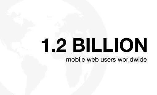
If you still have it in your head that mobile web design and application development is a niche industry, you need to change your way of thinking. Mobile isn’t a trend, nor is it even the future, it’s the present. Don’t believe me? Here are some crazy statistics to consider from Mobithinking:
- There are over 1.2 billion mobile web users worldwide
- In the U.S., 25% of mobile Web users are mobile-only (they rarely use a desktop to access the web)
- Mobile apps have been downloaded 10.9 billion times
- Mobile device sales are increasing across the board with over 85 percent of new handsets able to access the mobile Web
One of the most potent facts here is the second item, which brings to light that many users will likely only ever see the mobile version of your site. That’s an astounding revelation, isn’t it?
More than ever before the web is something that we carry in our pockets, not something that merely hangs out near our desk or even in our homes. This is a global trend that will only continue to see growth in the coming years. Are you ready for this? Does your professional skill set include web development for all important platforms or just the desktop arena?
Why Mobile First?

Odds are none of the people reading this haven’t learned anything new up to this point. The $500+ phones in the pockets of everyone you know are all the indication you need that the web has broken out of its computer shaped box.
However, the fact that mobile web access is popular does almost nothing to convince me that I need to pursue a strategy that puts mobile first. The flip side of 25% of mobile users being mobile-only is that 75% of them aren’t! The desktop is still an important medium, not to be forgotten or pushed to the back burner quite yet. So why are we even considering taking the mobile-first route?
One of the major catalysts for the rise of mobile-first web design was the announcement from Eric Schmidt in 2010 that Google was going to be taking this approach from now on, going so far as to say “I think it’s now the joint project of all of us to make mobile the answer to pretty much everything” (source). Why this drastic change in approach?
Graceful Degradation vs. Progressive Enhancement
These are some major buzz words from a few years ago that can still lend a lot of insight into the notion of mobile-first web design and why it’s an important concept to consider.
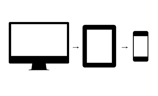
Graceful degradation arose out of a need to have a design function on as many browsers and platforms as possible. Designers and developers wanted to take advantage of new technology without excluding users with setups that didn’t have support. The general conclusion was to create and serve up the best experience possible, and then account for each possible degradation and ensure that despite any shortcomings, the site would remain functional.
In terms of mobile web design, this meant that a full, standard website would scale back and gradually remove content and features as the viewport became smaller and the system simpler (no Flash support, etc.).
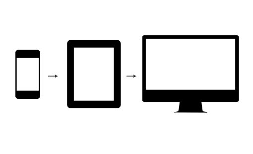
Out of this trend arose a powerful new idea: progressive enhancement. In this version of the tale, you put your best foot forward on the mobile platform, providing the users with minimal screen real estate, processing power and third party plugins an amazing experience that both looks great and functions perfectly. As the need arises, the site can gradually be “enhanced” and even completely rethought for larger platforms with fewer constraints.
Why Progressive Enhancement Wins
At a glance, these two methodologies seem roughly equivalent. Who cares where you begin the design process as long as it gets done, right?
The reality of the situation is a little more complex though. When you start with the desktop platform, you tend to want to take advantage of everything that the platform has to offer. You build an amazing product that leverages lots of great technology, only to realize that none of it scales well down to mobile. This can and does lead to severely watered down mobile products that feel more like an afterthought than a polished, finished product. Does this happen with every project? Perhaps not, but the story is likely far more common than you’d like to believe.
If we examine the progressive enhancement workflow, the result tends to be a different story. Here we’re starting with a project that is both super lean and quite impressive. You’ve taken all of that starting energy and put it into creating a product that looks and functions well despite the many restraints that you faced.
More importantly, you’ve already gone through the problem of trimming down the content to its most vital elements. Now when it’s time to bring this design to the desktop, instead of facing the decision of what to cut and how to water down your product, you instead get to decide how to make it even more robust!
Web Content: Best Served Selectively

The above argument comes at you from a purely philosophical standpoint with the ultimate conclusion being that the result tends to be better if a mobile-first approach is taken. If you want an argument with a little more observable substance behind it, look no further than how you serve up your content.
If we take the graceful degradation viewpoint, all of the content (text, images, video, audio, etc.) is served up at the same time to what is assumed to be the largest platform. From here, mobile versions are accounted for that simply ignore or remove much of this content from the page. The problem though is that it was already loaded in whether the given platform needed it or not. We find ourselves serving up more content than is necessary on the platform that is often associated with the slowest download speeds. See anything wrong with that?
With a mobile-first viewpoint, we start by loading the absolute bare essentials on the smaller platforms. This leads to a snappier experience that avoids unnecessary lag. The additional resources are loaded strictly on an as-needed basis to platforms that can handle them well.
What About Responsive Design?
How does this all fit in with responsive design, the other trend that’s taking over the web? The good news is that these two strategies aren’t competitive. You could say that they were made for each other.
Responsive design is built around the concept of media queries that target specific devices and viewport sizes. With this in mind, you can code up your initial CSS given a mobile perspective and then use media queries to selectively serve up additional styling as the viewport size increases.
This is likely the opposite of the method that you typically take with responsive design: start big and then reduce. Given the arguments above though, there’s a lot of logic behind structuring your media queries from small to large.
The Big Fat Downside

Hooray for mobile-first web design. It’s the greatest thing to hit the web since The Oatmeal. So why am I not excited about it? Why, even though I gush over responsive design, have I often downright avoided the topic of mobile-first web design?
The answer here is simple: it’s neither fun nor easy. Sure responsive design is tricky, but it allows me to flex my layout muscles and leverage a lot of built-in browser functionality to perform some cool feats. Responsive design makes my toy box bigger, not smaller.
With mobile-first design though, I’m hit over the head with constraints on step one. That’s no fun at all! Right away I’m faced with a smaller screen, fewer resources, and a bunch more headaches. Further, it’s just not the comfortable territory. I’ve spent most of my web design career in the desktop space, building experiences around mouse hovers and clicks, not finger tips. I’ve done plenty of mobile work but I wouldn’t call it my strong suit.
Most importantly, from a strict design perspective, I find it very difficult to dive into a design if I’m starting with mobile and working my way up. I mentioned this in a recent article to plenty of “huzzahs” in the comments and have even heard leading industry professionals sing a similar tune.
Rising To The Challenge
Let’s look for a second at my arguments for and against a mobile-first design approach. In the “for” category, we have straightforward and logical arguments that are difficult to downplay. In the “against” category I have a lot of whining and personal hesitation. Which side do you think wins this battle?
Perhaps you have some better anti-mobile-first arguments than I do, but if I look at this from an objective viewpoint, it’s evident that the mobile-first approach is the stronger contender.
This means that I probably need to get over myself and rise to the challenge of beginning projects with a mobile viewpoint. If I’m not comfortable designing for mobile-first, good, that means I have room to grow and techniques to learn.
Ultimately, if my reasons for adopting a mobile-first approach are user-centric and my reasons against it are personal, then I have to give up a little bit of comfort in the name of being a better designer.
What’s Holding You Back?
You now know all about how great mobile-first web design is for your users. You know that big companies like Google are taking this approach and you can see the benefits of a mobile-first workflow. So what’s holding you back?
Do you share my perspective that mobile-first is a difficult strategy to implement and agree that you just need to take the leap? Or is there something more substantial holding you back?