There are several types of landing page. You might be aiming to generate leads, tease a new product or service, offer a freebie, or ask your users a question.
If you’ve worked through the process of developing a mobile app, having a clear, professional landing page is a critical piece of your marketing mix. It’s the first interaction that potential users will have with your app, and it’s your chance to encourage them to download (or buy) it. It’s not as easy as it sounds.
A mobile app landing page has to showcase just the right amount of information, and have a clear call-to-action (CTA) in an effective place. Not all landing pages get all these elements right.
If you’re designing a landing page for your own mobile app (or just wondering how the professional designers do it), have a look at these examples of inspiring and impressive landing page designs to get the ball rolling!
Zoomlee

At first glance, this landing page looks fairly ordinary. The magic only begins when you start scrolling down. The fascinating animations used in this landing page to showcase the app’s different features will instantly grab your attention.
Nuansa App
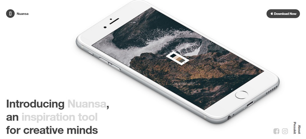
Nuansa is an app for designers and creatives to share color palettes based on stunning nature photography. The landing page for the app uses a non-scrolling design with an automated carousel that showcases the many features of the app. It’s truly beautiful to stare at.
Zero

The landing page for the banking app, Zero, uses a minimalist design that includes a lot of information about the app. The odd, but wonderful, scattered placement of the content gives a unique look to the page.
Trov

Mixed with video backgrounds, animations, and interactive elements, the landing page for the on-demand insurance app, Trov, takes landing page designs into a whole new level. The smooth parallax scrolling effect and the amazing animations add a nice entertaining touch to the design.
Yarn

This is a beautiful example of a mobile app landing page that takes minimalism to the next level. There’s plenty of white space on this landing page and the Yarn app uses that space well to clearly highlight its features and options.
Paper Planes

Paper Planes is a unique mobile game where people from around the world catch and throw virtual paper planes together. The landing page for this amazing app uses a full-screen animation to great effect.
Google Allo

The landing page for Google’s new smart messaging app, Allo, uses an old-school design mixed with video demonstrations of the app’s functions.
HelloMind

This landing page uses an interesting design that uses CSS elements to make the mobile app stand out throughout the page. It also uses plenty of subtle animations and video demonstrations as well.
Trippeo

Trippeo is an app that helps you figure out a budget for your travel plans. The landing page for the app is just as interesting as the app. It uses stunning animations, background videos, and interactive elements to show off various features.
TaxiNet

The beautiful animations, use of the right colors, and the unique design will make you reload and browse this landing page over and over again. The TaxiNet’s app landing page looks simply perfect.
iGO Navigation

The landing page for the iGO Navigation app uses a set of great background images to add a human touch to the page and to show the purpose of the app. It also uses a parallax scrolling effect throughout the landing page.
Line

Apple was the first to introduce using large fonts and headlines on landing pages to grab the attention of the visitors. The landing page for the popular messaging app, Line, also uses the same technique on its page to showcase the app’s features.
Rolo Calendar

The Rolo app describes itself as “a calendar for people who don’t use calendars.” And you can see why by visiting its app landing page. The design of this page is odd and interesting at the same time. And it will make you want to click on that download button to learn more about the app.
Gameit
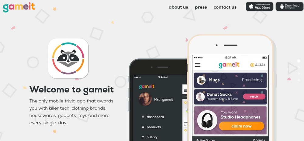
Vivid colors, animations, beautiful illustrations. What’s not to like about this landing page? With just four scrolling screens on the app landing page, you can learn everything about this trivia app.
ToDoist

The landing page for the popular to-do list app, ToDoist is simple and elegant. It heavily uses mockups with just the right amount of contextual information to lure in new users.
With the right amount of inspiration and imagination, you can think outside the box when designing your next landing page.
The best examples above include just enough information to tease what the app can do for you, encouraging people to take the next step of launching an app store to learn more.
Pulling through the design and personality of your app itself is also key. Your landing page is a key introduction to what people should expect from your app, so consistency is key!